01 · What the migration broke
A platform move solved an internal technical problem but created a front-end trust problem.
Design was not involved in the original migration. After migration, posting metrics changed significantly and Sales and Customer Support heard substantial customer pushback. A cross-functional tiger team formed to understand why.
Most recovery work of our team focused on web, where workflow and posting problems were larger. However, our mobile team noticed patterns we could quickly adjust, and that's this story.
02 · How we diagnosed it
The designs looked fine. Customers’ phones told a different story.
We compared what customers were telling us with how they were actually using the product. The pattern became clear when we looked at their real devices, text settings and search behavior.
Too much scrolling
Carriers told us they were scrolling constantly and felt like fewer loads were available.
Enlarged system text
Many customers were older and used larger text settings, making each load card much taller than what we saw in our standard design files.
30+ minute search sessions
Our search-session metric showed users spending more than 30 minutes moving through results trying to find a load. While we don't know for certain if this was because of load quality or our designs, we had assumptions it wasn't load quality because carriers were finding the same loads on web with no complaints of "size".
03 · What customers experienced
Now that we knew it was the design, we needed to figure out what were the true issues.
We designed and reviewed as a team with standard display assumptions. But our research showed carriers used enlarged system text, making cards taller, showing fewer loads and requiring far more scrolling than our files suggested. We looked at our design choices and what could change.
Previous designs followed HIG suggestions of a base 16pt font, which allowed 3-4 loads visible on the screen.
Our brokers paid a lot for our product. Previous business decisions gave more room to broker name and logos. But our design team influenced a business change to user based products and not favoring one user over the other.
A brand update changed our product standards to have lots of space, but new research found that our users preferred denser designs, getting more loads and inforamtion at once.
04 · Choosing the right scope
There was a lot of workflow changes that needed to happen with web for the migration. So our mobile team had limited avaiablity to ship anything.
The broader migration pulled development from all teams. So small front-end changes were scoped out to adjust the mobile design.
The evidence for mobile pointed to information density, not a broken search model or navigation like web. Redesigning more than a few small changes would have added engineering, QA, and customer relearning without addressing the simple problem.
This was not about making the UI smaller for aesthetics. It was about restoring scanning efficiency in customers’ real accessibility and system-text settings.
05 · What shipped
More loads. Same screen. Same logic.
We reduced type where appropriate, tightened card height and vertical spacing, and increased what customers could scan at once. Preserving the data, search logic, navigation and information architecture. Providing a solution of only Front-End work and QA with design, not development.
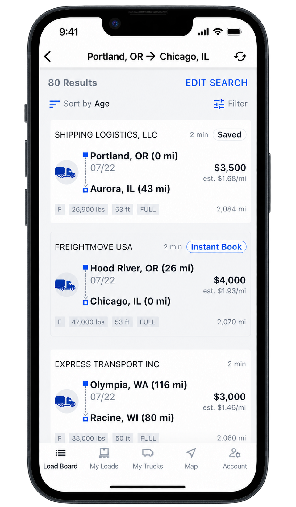
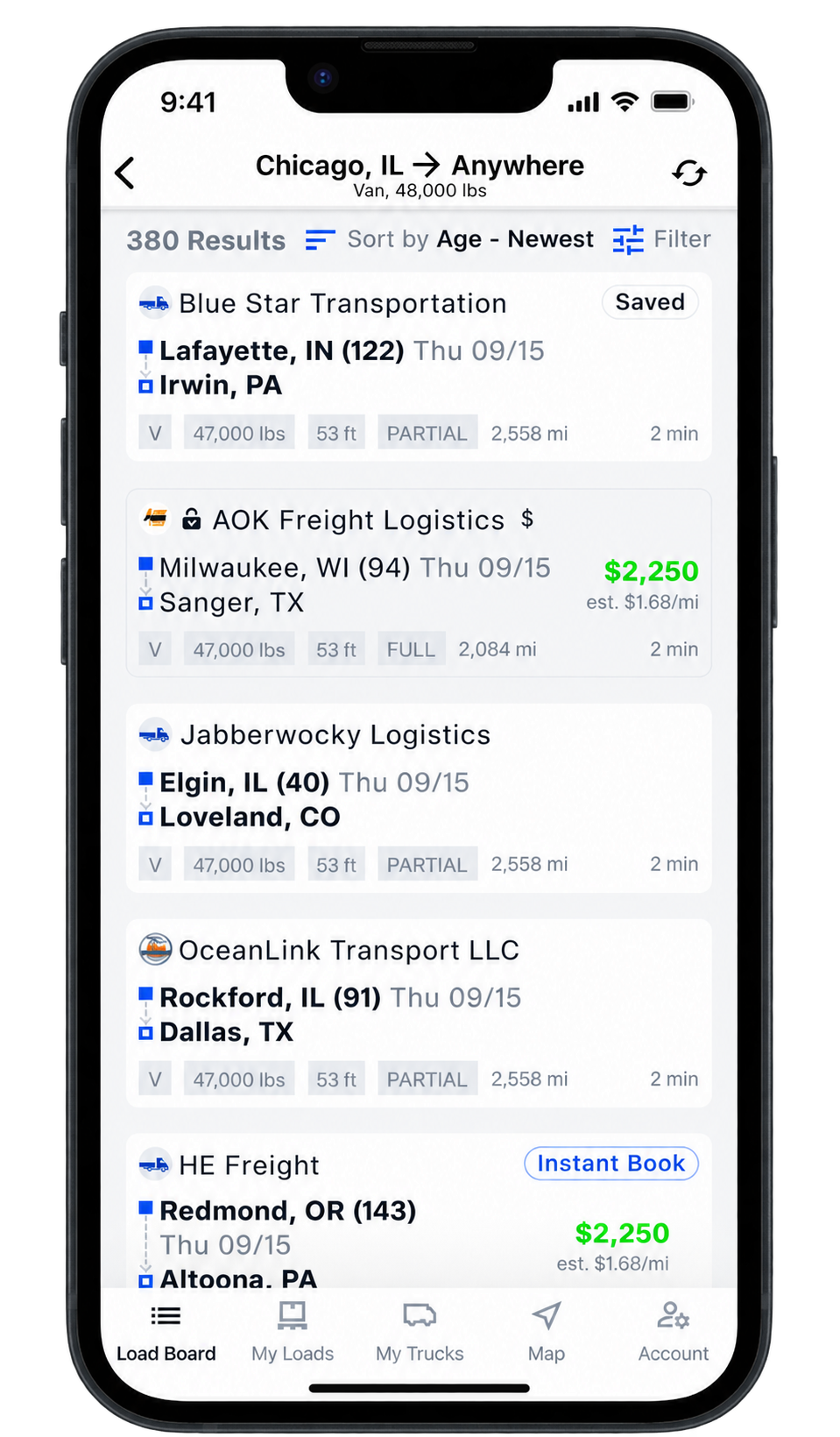
Once the direction was clear, the changes shipped within a quarter with 1 developer.
06 · Measuring recovery
We built a consistent system of customer sentiment.
During the discovery phases of this tiger team, I helped create and manage monthly mobile CSAT surveys in Stonly, an in-app tool that let us prompt customers without engineering work for every survey. I also helped break down and interpret the feedback.
Search sessions also shortened meaningfully after the density change, giving us another signal that customers were reaching a load interaction more quickly. It was a directional proxy, not proof that a load was booked.